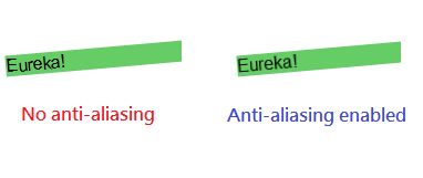
Text rotation can be done by CSS3 3D Transforms. But after the transform the text is aliased. For WebKit browser, the anti-aliasing feature could be enabled by adding the following CSS style.
  * {
    -webkit-transform: translate3d(0,0,0);
  }
Here is the updated example from CSS3 – Text Rotation by 3D Transforms
<html>
  <head>
    <style type="text/css">
      #rotate {
        -webkit-transform: rotate(-5deg);
        -moz-transform: rotate(-5deg);
        -ms-transform: rotate(-5deg);
        -o-transform: rotate(-5deg);
        background-color: #6C6;
        font-family: Arial;
      }

      * {
        -webkit-transform: translate3d(0,0,0);
      }
    </style>
  </head>
  <body>
    <p id="rotate"><span>Eureka!</span></p>
  </body>
</html>
For Firefox which uses the Gecko engine, the anti-aliasing is enabled by default but the effect varies among different Firefox versions.
For Internet Explorer, LET’S FORGET ABOUT IT. =P
Done =)
Reference: StackOverflow – Improve css3 text rotation quality


Thanks!, it’s really good… helped me alot 😀
LikeLike
Good to know that i could help. =D
LikeLike